
Connect & Listen
“We aren’t coming to you for your deliverables. We are coming to you for your ideas.” When the Cook County Assessor’s Office chose Clarity Partners for a website redevelopment project, the CCAO team was honest: while design and functionality were important, there was a bigger message to convey. Cook County Assessor Fritz Kaegi had just been elected and CCAO needed help restoring the public image of the organization.
Our design team kept this larger communication goal in mind while designing the new website. When Assessor Kaegi came in to see initial ideas, Clarity Creative Director Suzie Miller presented a dual set of concepts. There were the designs they expected to see (same logo, new look) and a fresh approach, which included a “proof of concept” logo.
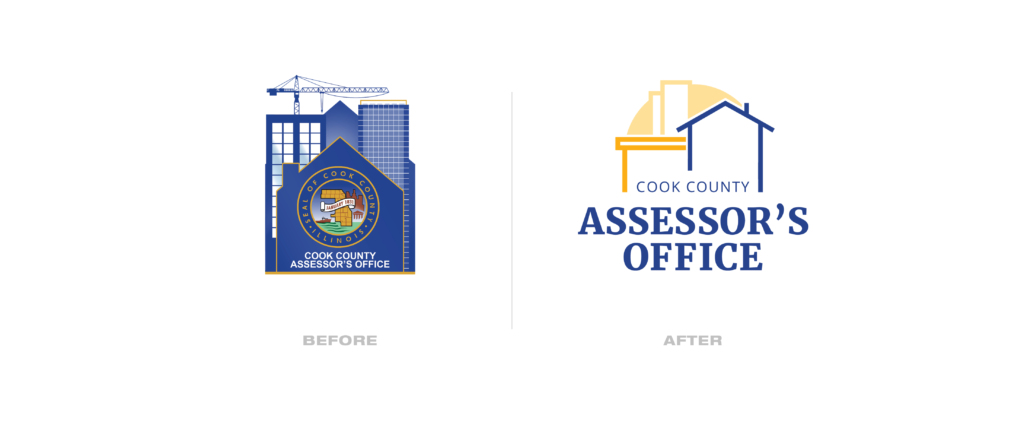
Initially, the secondary logo was presented for logical functional reasons. The original version took up too much visual real estate, was difficult to replicate (especially at smaller sizes), and very hard to read or understand. A new logo would allow us to not only fix those problems, but also illustrate how the website could appear more modern and support the public image of CCAO that Kaegi wanted to project. Miller understood the importance of CCAO having brand assets that could fully support their business processes – and that intuition paid off. “I suspect I developed some level of trust with Mr. Kaegi at this point,” she said.
From there, Assessor Kaegi posed an important question: would retaining the existing, old color palette communicate the wrong message?
An open dialogue began to take place between the two teams. Clarity was able to explain how the existing color palette already evoked the right emotions: blue translates to honesty and reliability, and yellow reads warm and friendly. There was no need to reinvent the basic color elements of the site – they just needed to be put together in a fresh way.

The proposed future logo was discussed in greater detail. Each member of the Assessor project team became involved in the creative process, providing insight about what the logo should (and shouldn’t) be.
Putting pen to paper (more specifically, Sharpie to Kraft), the Clarity / CCAO team got to work.

Create & Collaborate
After a brief Discovery phase, Clarity Partners presented over ten initial logo concepts to CCAO. In a joint creative session, the team determined which concepts met the Office’s communication objectives best: conveying the values of the Assessor’s Office (fairness, transparency, ethical and reliable public service), without losing sight of the function of the Assessor’s Office (setting fair and accurate values for Cook County property owners to support and stimulate economic development, job creation and the construction of affordable housing). These concepts were iterated upon, further aligning concepts to CCAO’s goals and exploring different stylistic approaches in black and white.

Clarity conducted further discussions around each concept, eventually adding colors and visualizing various use cases across different media types.


In their final internal review, the Assessor’s team uncovered an opportunity to make the logo foolproof. They discerned a more asymmetrical layout would suit their visual communication needs better.
Execution
This is the final logo and website, launched in January 2020.

Clarity established modern brand assets for CCAO. The full logo and set of supporting graphics can be replicated in one color across print and digital media, and the new logo solves the functional problems presented by the original logo: it scales, it can be easily replicated, and its relevance to the Assessor’s Office is easily grasped. Other brand assets, like the color palette and typography were documented, allowing CCAO team members to maintain a consistent visual brand.
Impact
Clarity’s design team worked diligently to bring the Assessor’s vision to fruition. Maintaining flexibility and open-mindedness as to the opinions of the CCAO team within the project timeline constraints, they gave us credit for our efforts: “great job with incorporating this new feedback so quickly.”
Our creative team designed a logo that aims to improve the perception of the Office by communicating fairness and transparency. Their updated branding better conveys the support CCAO offers Cook County residents and business owners in relation to some of their most valuable assets.
