
Most websites today use a content management system (CMS) — WordPress, Drupal, or a proprietary system — which makes it easy to provide the structure for an accessible website. The templating system keeps items like the header, footer, navigation, and forms aligned with WCAG accessibility standards by providing a way to change the items without affecting the underlying code structure.
Content changes in the main body of each page are a different story. When the toolset is used for more than plain, black text, there is a potential for introducing items that are inaccessible. Here are some accessibility best practices: 10 tips to keep your website on track.
Forgetting, ignoring, or having ineffective alt text for images
When new images are placed, the alt text is often forgotten or entered incorrectly. best practices
Solution: Use brief but descriptive alt text. If you are using WordPress, the media library has a mechanism that can flip through all of your previously uploaded images and fix missing/inaccurate alt text.
Putting important text within images
This is a convenient time-saver to reuse materials like an already-designed printed flier. But re-using the same text-heavy presentation as a placed image in a website is a common accessibility failure.
Alt text is meant for descriptive summaries. It is meant to be scannable, not complicated. Alt text stops being technically useful after 100 characters, but it stops being real-world useful when it exceeds 5-7 words. Alt text is not meant to be transcriptions or captions of complicated images. best practices

Removing large text passages from within images and having them as separate text items also helps search engines crawl your site and helps with automated translation tools.
An image containing text that is unique to the page is not scanned nor translated by translation tools.
Solution: Keep extended passages of text out of images. They should be entered as text.
Non-descriptive link text
The CMS toolbar linking icon has a mechanism that enforces best linking practices, but when passages of text are pasted into your website they may often have incorrect link text. Not everyone follows the basic concept of descriptive text links, so when they are pasted into your site without correction, your site becomes less accessible. best practices
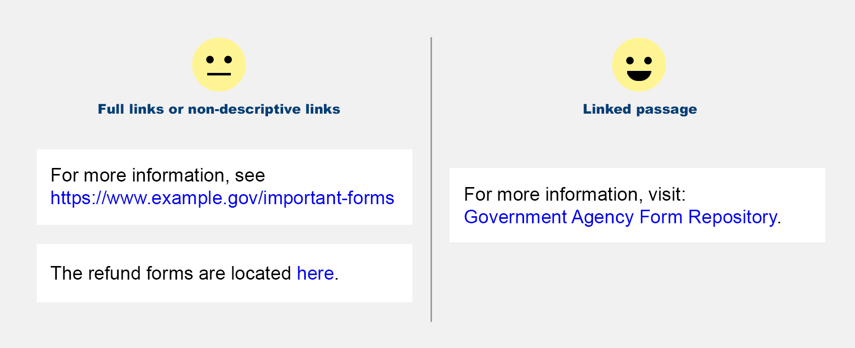
Solution: Use specific text for the linked passage. Use a link scanning program to crawl your site and identify common errors and correct the link text.
Using headers sizes to apply a font size/color
Header sizes in Hyper Text Markup Language (HTML) — the programming language of web pages– are designed to mark a level of importance and structure. Both search engines and disability tools use header importance to serve as waymarkers on the page as well establish items from most to least importance on a per-page basis.
Header “sizes” are reflected in the H1-H6 header tags — but they actually refer to “importance” numbering — which go from H1 (the most important item, almost always the title of the page) to H6. Most websites don’t use more than H1-H4, so there is common misuse of H5 & H6 to “get desired text effect.”

Solution: Use header importance to show proper nesting and always nest in descending order without skipping levels. H1 should only appear once on each page, header tags with higher numbers (less importance) should not skip values. For example, an H4 should only appear nested under an H3, not directly after H1 or H2.
Typing text as ALL CAPS to show importance
Typing in all caps is perceived as screaming or an abbreviation to screen readers (and some people). In the event that your website has a “small caps” style, this text should be entered as a mixed case and the site’s stylesheet will transform to small caps treatment. If something is an abbreviation, yes it should be all caps. EX: ACLU, PBS, WHO. (You should also be following a style guide that uses the expanded form of the abbreviation on their first use on the page.)
While the CMS toolset may allow you to go overboard with emphasis — applying multiple treatments to the same text passage — is not recommended. Making something ALLCAPs, bold, italic, a huge font size in a contrasting color is overkill. best practices
Solution: Avoid all caps unless it is a (previously-explained) abbreviation. Only apply one treatment — possibly two — to make text passages stand out. You shouldn’t be using 3+ styles or mis-using header importance tags (see previous tip). best practices
Using only colors or icons as an identifier
Using colors as a key doesn’t relay information properly to machines (screen readers, search engine spiders) or people that don’t see color with 100% accuracy.
Colors should not be used as the sole identifier for text or images.

Charts and graphs should have field labels or a secondary shape or pattern.
Solution: Use icons to supplement, not replace, important information. With the exception of universal signage standards (stop sign, handicapped access, gender identifiers) not all symbols have precise meanings. Icon images on a webpage — with proper alt text — should be used decoratively, next to the proper text.
Embedding videos that are not captioned
If you have videos inserted into the content of your page, they should be captioned. The most common and popular hosting service for videos — YouTube — offers AI-generated auto-captions, but these are not 100% accurate.
Solution: If you are embedding a video it should have accurate captions. If you produced the video, you will have access to the auto-captions stream to use as a starting point to correct and upload as the video’s proper captions. Alternatively, you can insert a transcription of the video’s contents on the page below the embedded video.
Misusing data tables
Data tables are a formatting tool in the CMS toolbar that allows structured data to appear within the page. This is intended for tablature data — like an excel spreadsheet snippet. The table tool is often seen as a tool for “an invisible grid structure” that allows a somewhat precise layout of content. The problem is, screen readers see it as data fields to be navigated. The layout they provide often has wrapping issues when a large item takes up a cell, it holds all shared columns and rows open the same width or height.

Solution: For the table tool, only use it for data with properly-labeled columns and rows. Precise layouts not already handled by the templating system in place can be remedied with a template revision.
Not simplifying writing and/or interface
An often-cited guideline for newspaper journalists is to write for an eighth grade reading level. Vocabulary should be simple, sentence structure should not be overly complex, and jargon and initialisms are explained in their first use on each page.
With the internet being global there are some additional considerations. If you have a potential global audience, or an audience from different backgrounds, cultural idioms should be avoided. Use “core business focus” instead of our “bread and butter.” If your site’s audience is specialized, for example communicating scientific ideas with fellow scientists, your top-level pages should be simplified to the layperson audience (ex: potential students, potential donors). Digging into the site further, scientific concepts and papers can remain complex as they will be for the scientific community.
Solution: Regardless of your site’s audience, simplification with some common UX is better than over-explaining. (UX — User eXperience — “should this be here” vs UI — User Interface — “how should this look here.”)
Let’s look at this in practice, examining this use of “Online Food Delivery Form.”

All of these words aren’t necessary. If a user or your site uses translation tools, complex concepts get more confusing and you end up with this:

So what would be the best way to refine this menu item? First of all, “Online” is redundant. You are on a webpage and clicking the link takes the user to a webpage. Webpages are online. So now that we’ve ruled out the purpose of adding the word “Online,” let’s look at what’s left.

If you think about it, “Form” is also unnecessary. The concept of a form is a standardized format to ease communication and ensure all necessary information is filled out. Unless your business model is sending people random items at your discretion, it is implied that a selection process is performed by the user.
So now we just have “Food Delivery.” This would be acceptable if it is communicating that you carry other products, but only food items are available for delivery.

If all you sell is food and 100% of your inventory is deliverable, “Food” is redundant. “Schedule Delivery” is more direct and also more efficiently translated.

So this simplified text doesn’t get lost on the page, it should be styled differently. This is the UI (User Interface) part.

Great. Now how does this simplification impact translation tools? Less complicated, more clear.

Going rogue
The content editing toolset was put in place with website accessibility in mind. Using work-arounds like pasting code into a WYSIWYG area or installing extra plug-ins (in WordPress) to get a particular new feature potentially introduces both accessibility and security issues.
Finding a code snippet on a tutorial website, pasting that code snippet on your website and verifying its functionality doesn’t verify its accessibility or that it is a best practice. You may have been caught up in the ‘wow’ factor of an auto-advancing slideshow seen on countless websites, but they are not accessible. Yes, they are common but motion that is not user-initiated is not accessible.
Solution: Resist the urge to add bells and dingers to your website unless you can verify they meet accessibility standards first.
Website accessibility is a continual process
So now you should be good, right? Nope. This “clean bill of health” only lasts until you change or add more content.
When you edit content, you have to be responsible for continuing the accessibility standards on the site. If all of your site’s editors are familiar with best practices for website accessibility when entering content, this checklist will expose fewer and fewer infractions over time.
Introducing a periodic “site wellness check” to audit your site 1-4 times a year will help you catch non-compliant content that has been added since the last audit. There are some automated tools which can review your site’s pages for technical issues, but not language issues — those require a human.
Built into browsers or as a browser add-on “Lighthouse” or “axe Accessibility” can check for accessibility violations per-page. “Siteimprove¹” can check an entire site. Link crawling tools such a “Screaming Frog SEO Spider²” (multi-platform program) or “Integrity Plus” (Mac only) can crawl your entire site for correct/broken links, but also reports the text being used for links, so you can correct all “click here” or “https://www.example.com” that are being shown.
As you are more mindful of the content-making pitfalls to avoid, over time fewer issues will need to be corrected. Remember, accessible websites benefit everyone, not just people with disabilities. By designing for inclusivity, you create a better user experience for all your visitors.
Gerald Angelo is a Senior Solution Engineer at Clarity Partners. Working primarily with Drupal and WordPress websites, he makes the projects both look and operate well on both the front and backend with a focus on User Experience (UX) and Accessibility. In this article, he discusses the reasoning, limitations, and results of leveraging a page builder solution on the WordPress platform.