Web Accessibility Explained
Here at Clarity, we have been talking about web accessibility for a long time. Recently, though, it has become more urgent for many organizations. Ideally, accessibility is considered from the very beginning of a project, starting with design and continuing through development and content creation. In reality, that is not always the case, and expecting teams to already know what accessibility is or how to address it can feel overwhelming.
If you are here, you may already know that websites are required to meet accessibility standards by April of 2026, even if you are not entirely sure what those standards involve or where to begin. This page explains:
- What web accessibility is;
- Why it matters for both users and your organization; and
- The practical next steps Clarity can take to help you assess, remediate, and maintain an accessible website.
What Accessibility Means
We’ve said it before: web accessibility ensures that people with disabilities can use your website just as easily as anyone else. This includes people who are blind or have low vision; are deaf or hard of hearing; rely on a keyboard or screen reader to navigate; or live with cognitive, learning, or mobility challenges.
Many websites, however, are built with a primary audience in mind, one that has clear vision and no physical or cognitive barriers to navigating, reading, or understanding on-screen content. For people who do experience these barriers and who may rely on assistive technologies to access the web, this can mean being unintentionally blocked or frustrated when trying to get information or services they need.
The video example below demonstrates what a properly structured website sounds like when read by a screen reader. As you listen or review the walkthrough, notice how easy it is to understand the page hierarchy, locate key content, and move through the experience efficiently.
Now ask yourself: could someone navigate your website this way? If you are not sure, or if you have never tested it from this perspective, that uncertainty is a sign that accessibility may not be fully addressed. That is where an accessibility assessment can make the difference.
Another common accessibility issues is color contrast. For people with color blindness or low vision, placing two colors together that are meant to contrast but do not can make important information effectively invisible. The image below shows two buttons using different color combinations:
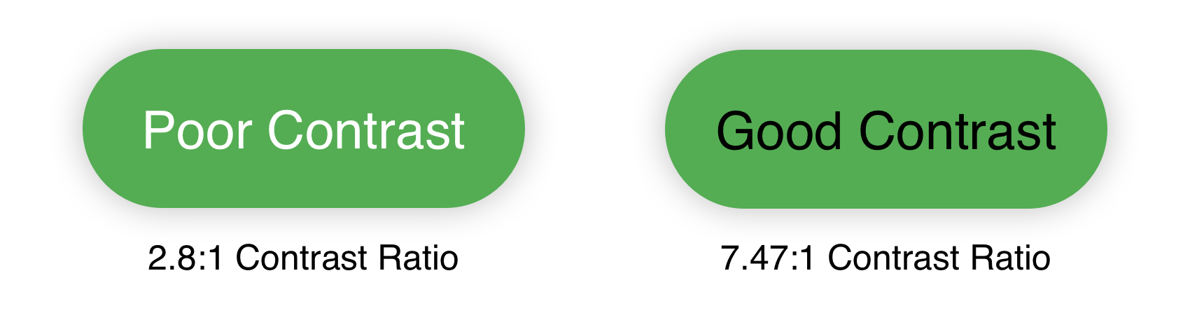
- Poor contrast: Light text on a green background with a contrast ratio of 2.8:1, which does not meet the WCAG 2.1 Level AA requirement of 4.5:1 and can make text difficult to see or identify.
- Good contrast: Dark text on a green background with a contrast ratio of 7.47:1, which exceeds the WCAG 2.1 Level AA standard and improves readability.
- Why it matters: Color contrast is difficult to judge by eye alone, so accessibility testing tools are essential for confirming compliance.
Color contrast is just one small piece of web accessibility, but it is a good illustration of how easily barriers can be introduced and how straightforward some fixes can be. It is also just the tip of the iceberg when it comes to the accessibility issues that may exist on your website.
What to Look For
So what are we looking for when we’re looking to improve a website so that everyone can get the information they need? There are specific standards and guidelines to follow, which in practice boils down to the following:
- Keyboard Navigation: All site functions can be accessed using a keyboard, including navigating menus, interacting with forms, and activating buttons or links. A skip link is available to allow users to bypass repetitive navigation and go directly to the main content.
- Screen Reader Compatibility: The site uses semantic HTML and ARIA attributes to ensure that content is properly announced by screen readers. This includes labeled form fields, meaningful alt text for images, and clearly identified landmarks for page regions.
- Text and Visual Adjustments: Users can resize text up to 200% without loss of content or functionality. The site maintains a strong color contrast ratio (minimum 4.5:1 for standard text) and avoids the use of color as the sole means of conveying information.
- Mobile Responsiveness and Orientation: The site is fully responsive across desktop and mobile devices and functions properly in both portrait and landscape orientations. Horizontal scrolling is avoided except where necessary (e.g., data tables).
- Form Accessibility: All form inputs include labels and instructions. Error messages are clear and programmatically tied to the relevant fields. Users are given an opportunity to review key information before submission.
- Content Structure: Headings, lists, and tables are properly structured to allow for consistent navigation and reading order. The default language of each page is set, and any foreign words are identified in the markup.
- Visual Stability: The site avoids flashing or blinking content that could trigger seizures and provides the option to pause or stop animations when used.
- Technology Compatibility: The site functions reliably across modern browsers and devices and is compatible with leading assistive technologies including JAWS, NVDA, VoiceOver, and TalkBack.
Some of what’s listed above may make immediate sense, and some may be a bit more opaque. In part that’s because website accessibility is judged on
- How the website is coded;
- How the content is structured and displayed; and
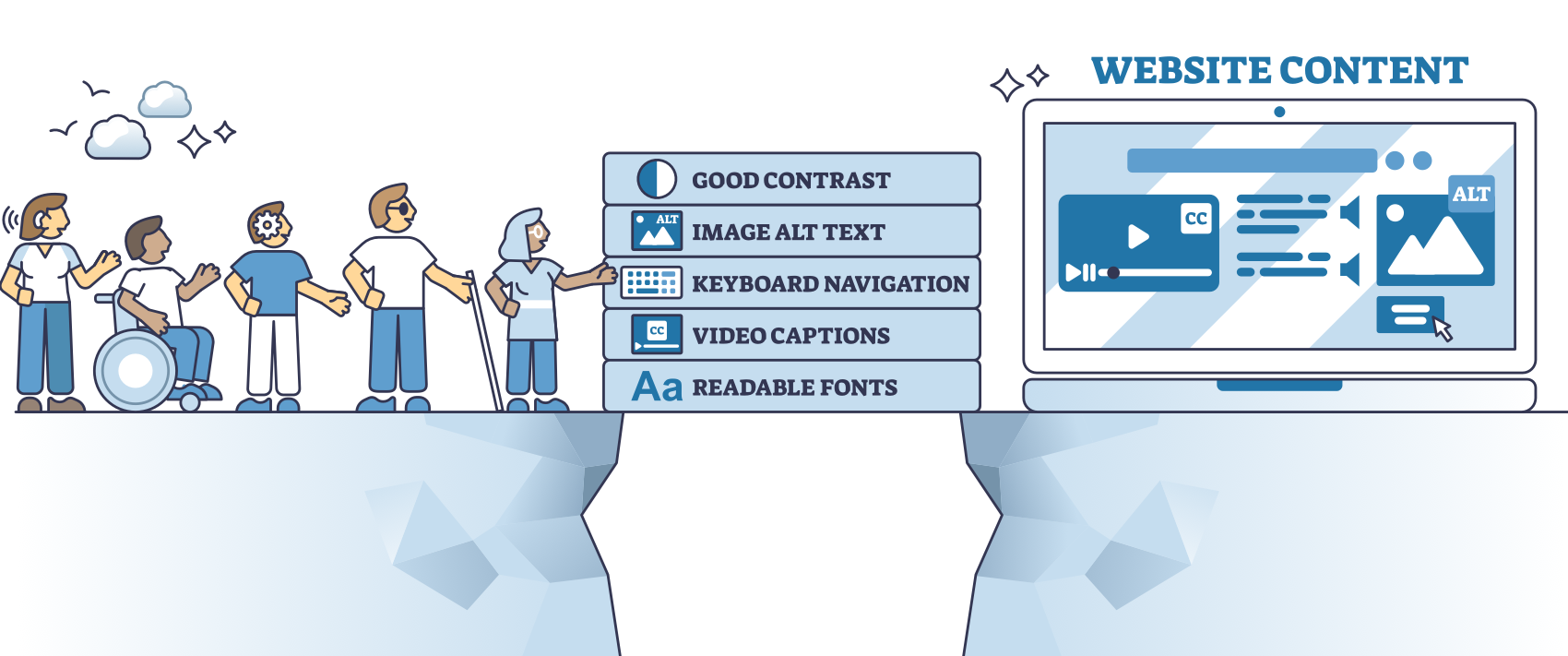
- How accommodating assets within the website (PDFs, images, videos) are for users.
In other words, you need to look at both website code and website content for a complete picture of how accessible your site is.
 A Note on Accessibility Overlays
Some accessibility tools promise quick compliance through overlays or widgets. In practice, these solutions often fall short and can even create new barriers for people who rely on assistive technologies. Accessibility is most effective when issues are addressed at the source.
How Clarity Can Help
If you’re not sure where to start, Clarity can guide you towards a solution.
 Assessment
Clarity will provide a baseline score of the current state of the site, identify what needs to be fixed (with specific examples), and whether it’s content or code.
 Plan for Remediation
From the assessment report, we can provide a roadmap for what needs to be fixed and who can do it, from code fixes to content changes.
 Training and Ongoing Guidance
Finally, Clarity can provide training and documentation, as well as ongoing monitoring options, to keep the website accessible and compliant moving forward.
In Conclusion
Accessibility affects how real people experience your website every day. If you have not evaluated your site through an accessibility lens, consider starting the conversation. Clarity can help you understand where you stand and what to do next.